photo:Takumi Ota


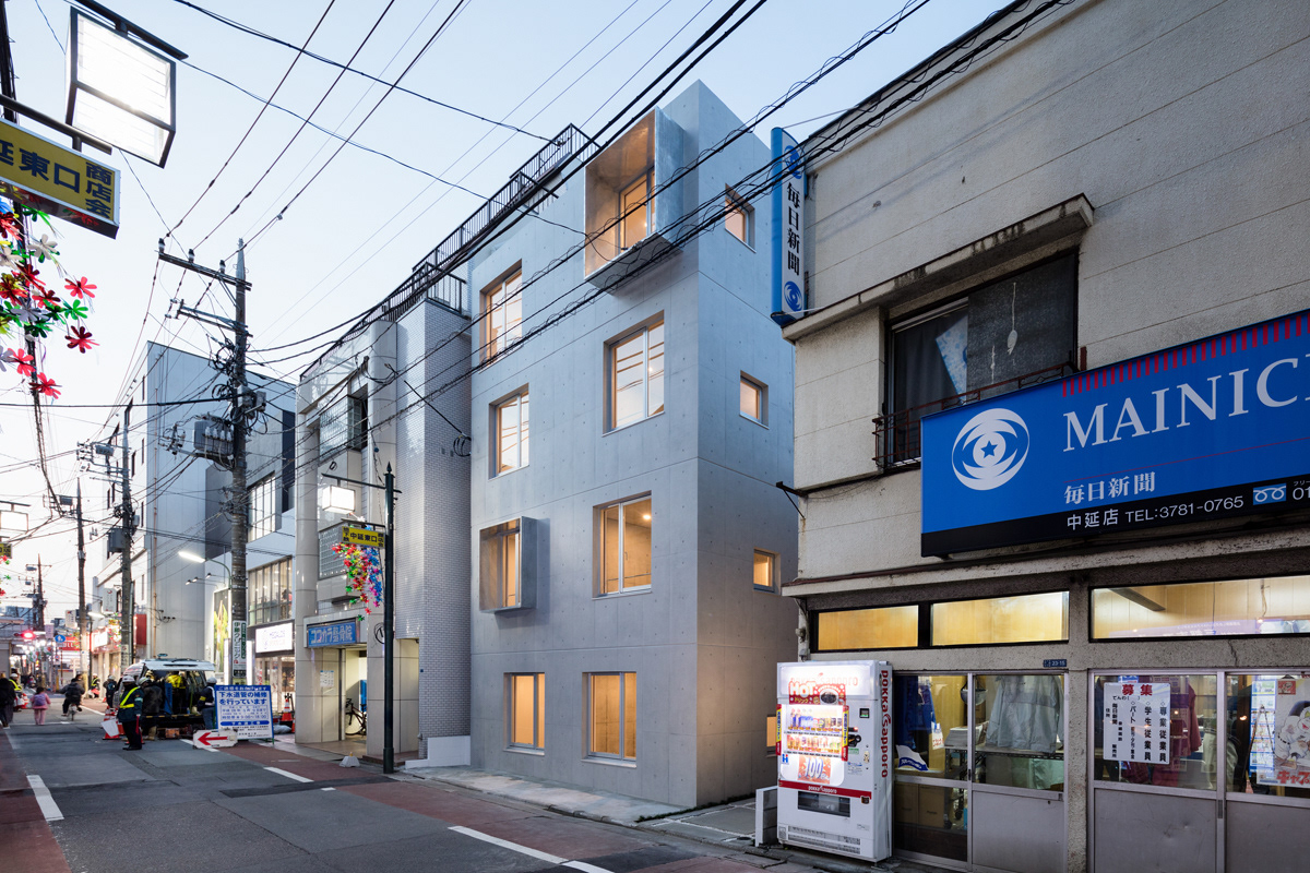
The building sits in a neighbourhood shopping lane in Nakanobu, just south to the central district of Tokyo. The town is a mixture of old and new. A grandma’s confectionary and a jazz festival, pensioners among young couples, all share the same streets happily together. The site locates itself in the vicinity of a newsstand, a bathhouse and alike. In order to fit in to this yet humble liveliness of the town, the building’s scale is restrained to those of the neighbouring buildings, 4 stories with only 12 units.
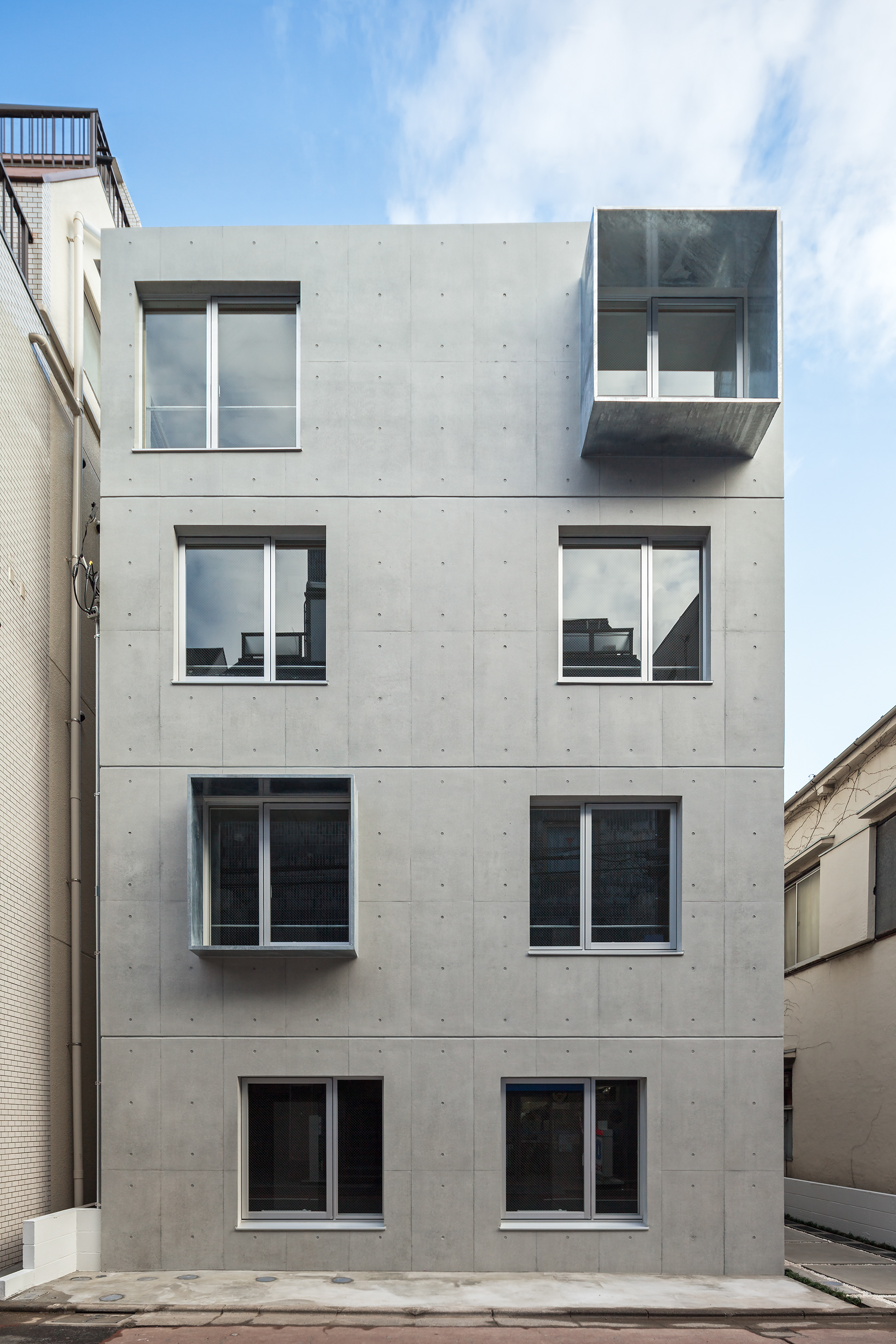
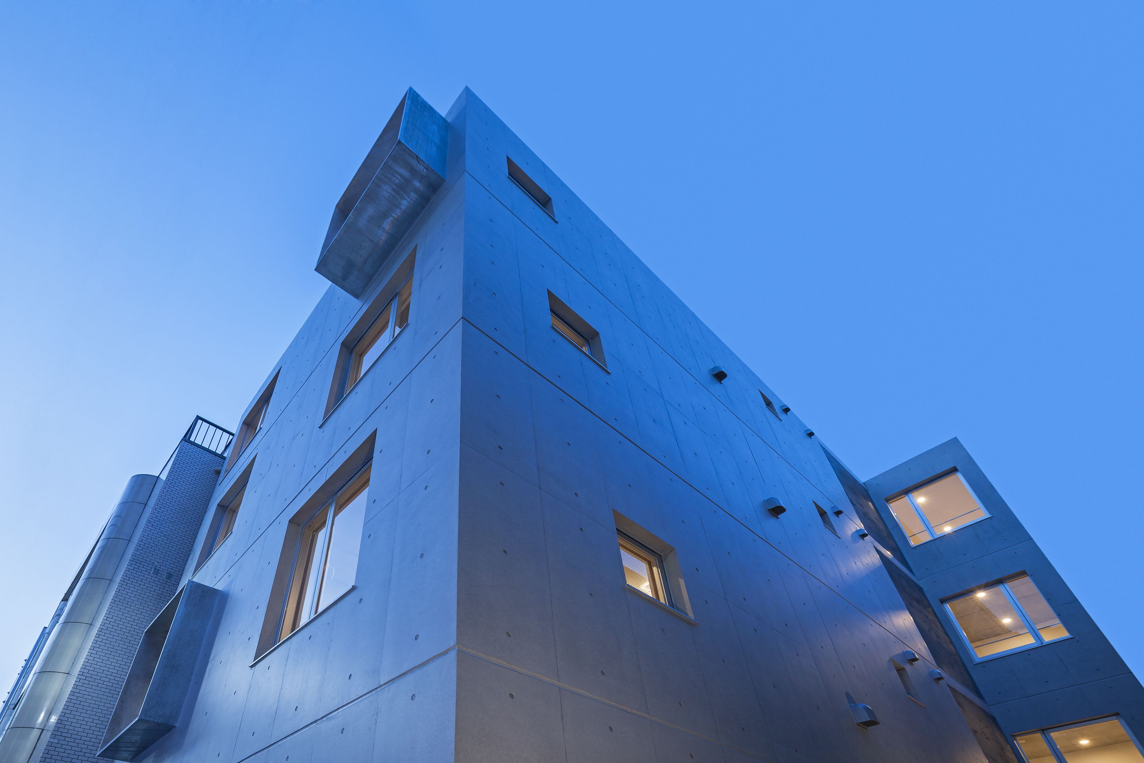
The skewed arrangement of the openings on the façade, concentrated at the bottom and spread gradually up, is to give a floating feel and to reduce massive weightiness of the concrete. A pathway secures an appropriate distance from merely 6m-wide busy lane on the front, giving privacy to the secluded entrance.
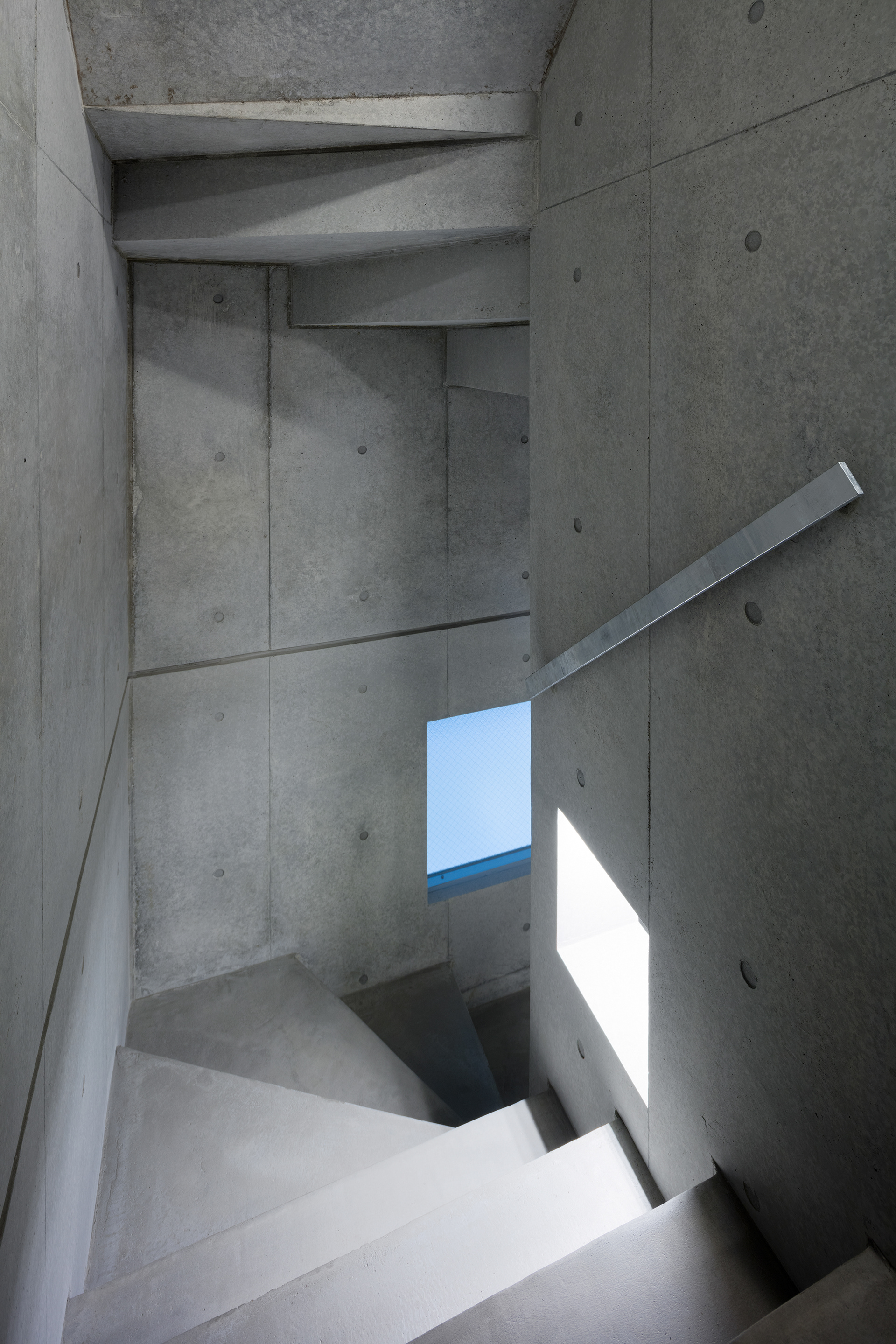
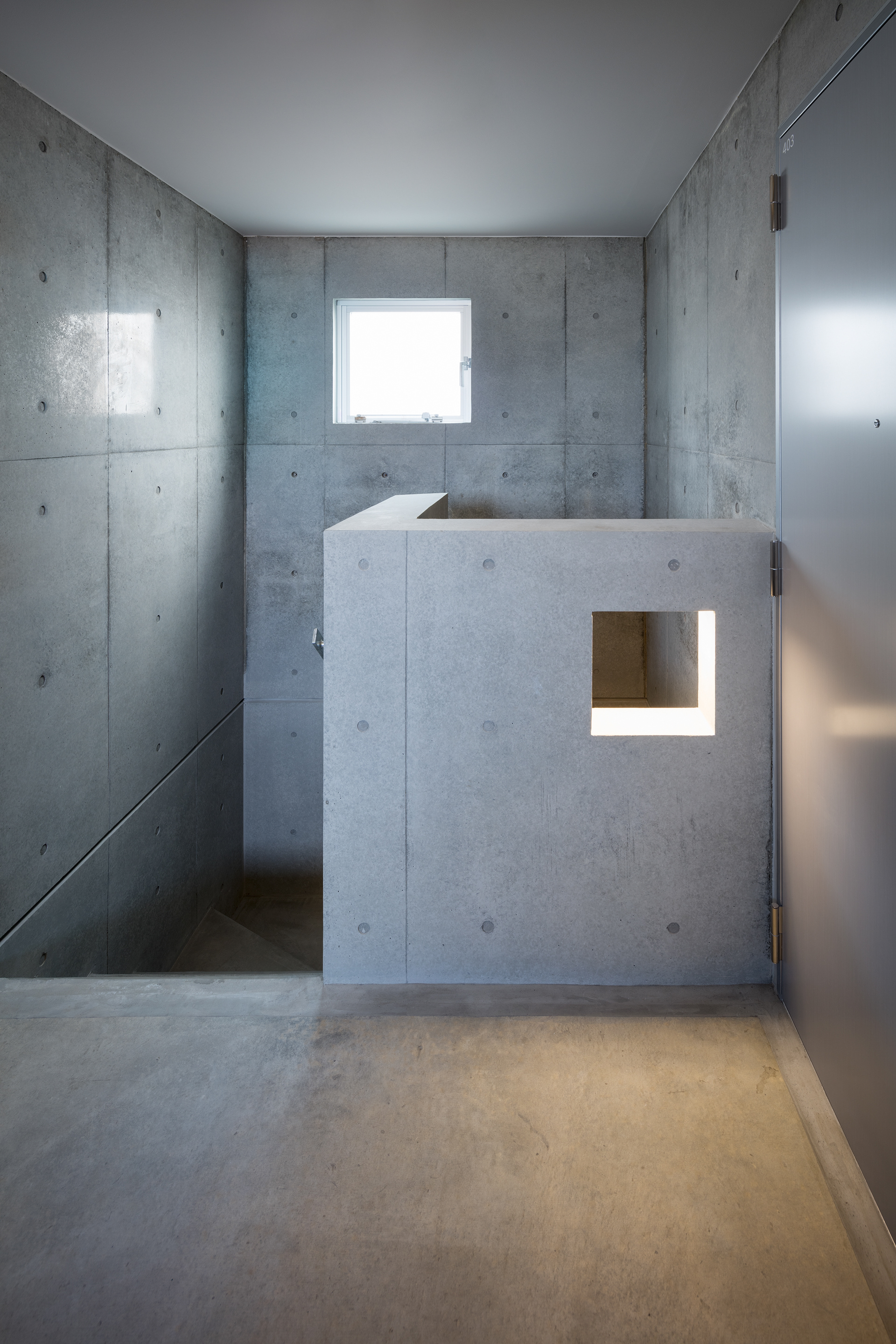
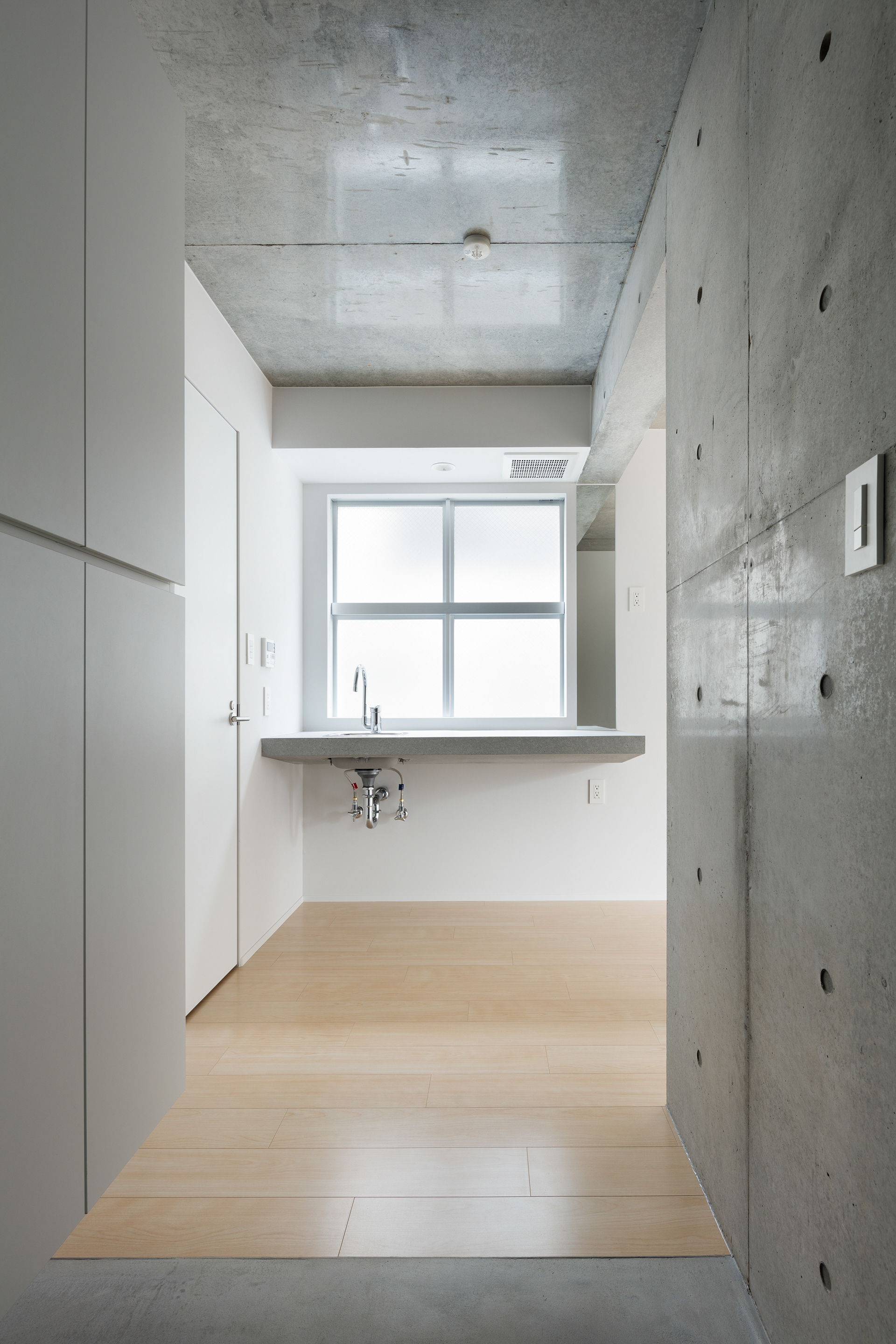
Interior is composed solely of exposed concrete and plain white walls in simplest possible details. Planning as well as design aims thorough simplicity: a set of modest independent walls replaces a closet; one tap serves cooking and handwashing. These propose minimal form of a collective dwelling, life unreliant on products, richness of not having. Minimalism here is in direct connection with the way of living.
The few elements left, on the other hand, are designed to stimulate new ideas for habitation. The storage walls, without limitation in usage, can be a perfect fit for a cosy den. The large concrete kitchen counter, a desk. Simplicity when resolute, gives out a new flexibility.
The few elements left, on the other hand, are designed to stimulate new ideas for habitation. The storage walls, without limitation in usage, can be a perfect fit for a cosy den. The large concrete kitchen counter, a desk. Simplicity when resolute, gives out a new flexibility.
Every single opening is square-shaped. Square is the purest, most primitive form of an opening when thinking outside modernist-style conventions such as verticality or horizontality. Every space inside and outside is rhythmically connected to each other through or across these square, pure openings.
Windows in particular are planned to mediate or control interpenetration between <inside - simple, minimal>
and <outside – lively bustle>. A colourful vigour of the shopping lane, trimmed with square openings and arranged on the interior wall, turns into a muffled, controlled scene. Shaped view of the city becomes the only ornamental element inside.
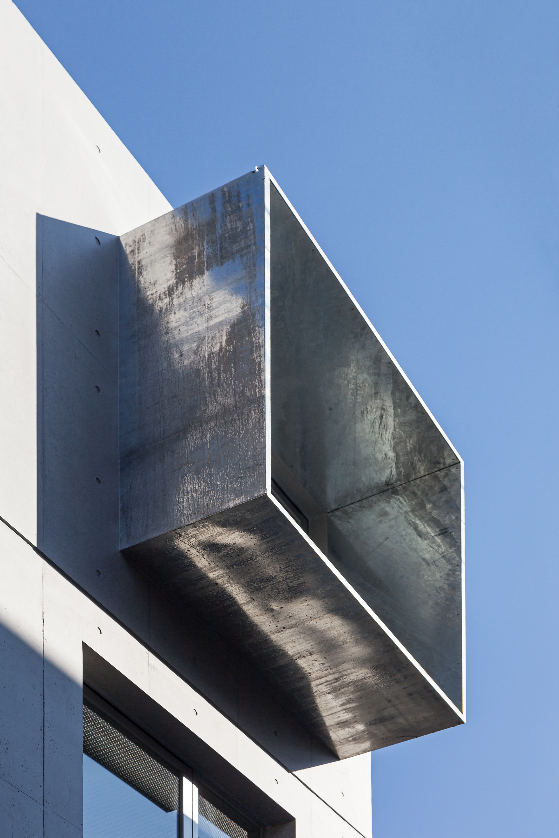
Galvanized steel window frames cast varying shadows to add a non-uniform expression on the facade, emerging as distinctive icons in the cityscape. These reflect outside activity back into the room, again adding variety to the view to the city.
Windows in particular are planned to mediate or control interpenetration between <inside - simple, minimal>
and <outside – lively bustle>. A colourful vigour of the shopping lane, trimmed with square openings and arranged on the interior wall, turns into a muffled, controlled scene. Shaped view of the city becomes the only ornamental element inside.
Galvanized steel window frames cast varying shadows to add a non-uniform expression on the facade, emerging as distinctive icons in the cityscape. These reflect outside activity back into the room, again adding variety to the view to the city.
中延は、東京都心部の南に隣接する国道沿いの街。饅頭屋とジャズフェスティバルが同居し、老若男女が集い暮らす活気あふれる近隣商業地である。本敷地もまた賑やかな駅前商店街に面し、銭湯や新聞配達店が軒を並べる一角に存在する。細やかな生活の息づく街への影響に配慮して、周辺建物とスケールを揃え地上4階、12戸のつつましやかな構成とした。
下階から上階に向けてずれながらひろがる開口配置は、ファサードに浮遊感を与えコンクリートのマッシブな重量感を軽減する試みである。幅員わずか6mの前面道路に適切な距離をとるため、商店街から敷地内部に路地を引きこみ、落ち着きとプライヴァシーを重視したエントランス空間を演出した。共用部は最小限に抑え、シンプルかつ効率的な平面計画としている。
住戸内部は白い壁とコンクリート打放しだけで構成し、無駄をそぎ落としたシンプルなディテールを追求した。意匠のみならず計画においても、シンプリシティを徹底した。クローゼットを廃し自立壁だけで仕切られた収納スペースを採用、キッチンシンクで洗面台を兼ねるなど、集合住宅の最小限の形を追求し、モノに支配されない豊かさ、持たない生活の形を提案している。すなわちライフスタイルと直結したミニマリズムである。
一方、残された最小限の要素は、新たな住み暮らし方のきっかけを提供するよう計画した。用途を限定しない収納は居心地の良い書斎にもなる。広々としたコンクリートのキッチンカウンターはデスクとして使用できる。徹底したシンプリシティからは新たな自由度が生まれると考えたのである。
この建物のあらゆる開口部は、「正方形」をしている。「水平性」「垂直性」といった近代らしさの約束事から自由になってみたとき、「正方形」は最も純粋でプリミティブな開口の形である。建物内外のすべての空間が、これら純粋な開口だけを介してリズミカルに接続する。
内外の関係においては、これらの開口が<内部 ― シンプル、ミニマル>と、<外部 ― 賑やかな喧噪>とを媒介し、適切に制御する装置となるよう計画した。多様な色彩の光あふれる商店街の風景が、この「正方形」で切り取られ、静謐な室内の壁に配置されることで、緩衝され制御されたシーンとなる。いわば室内においては、切り取られた都市の光景こそが唯一の装飾となる。一方外部においては、道路へと突き出した鋼板のフレームが時間に応じて多様な陰影を生み、ファサードに象徴的な表情を与える。このフレームはまた、新旧とりどりの街の風景を反射して室内へも取り込み、室ごとの景色に変化をもたらしている。
また、室面積や近隣との距離に比して開口を大きめに計画することで、光と風を多く取り入れるとともに、街との繋がり、空間的一体性を居住者が自在に制御できるようにも配慮した。
2017 All rights reserved by Sasaki Architecture and S.A.A.O